About a week ago, I met with Build to review their first design concepts. Build presented two separate concepts based on the pre-design meeting we had two weeks prior.
Overall, I have to say that I am thrilled with the progress. Both designs exhibit the exact design esthetic I’m looking for, while differing enough in their floorplans to present a great set of options for moving forward. I can’t stress enough the importance of hiring an architect who will show you full 3D renderings at design stage. You just can’t get a great feel for what a house is actually going to look like from a few two-dimensional schematic drawings. Below are some samples from the documents provided by Build:
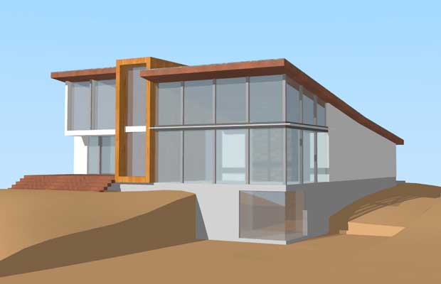
Model 1
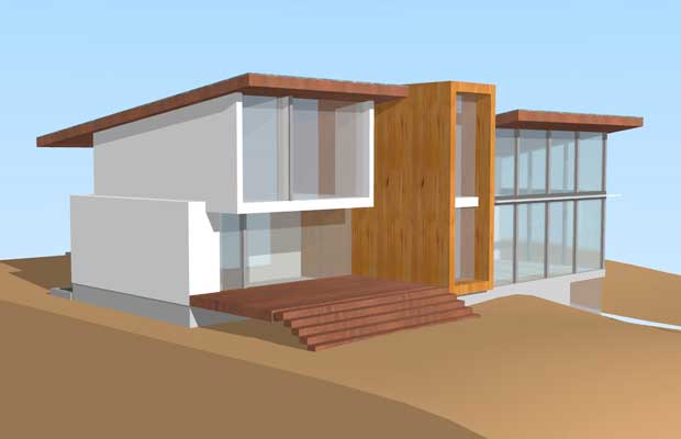
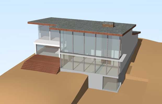
View from northwest of the house. This is the “back” of the house, but it’s the side that faces west, towards the huge view.
View from the lower lawn, looking up at the house.
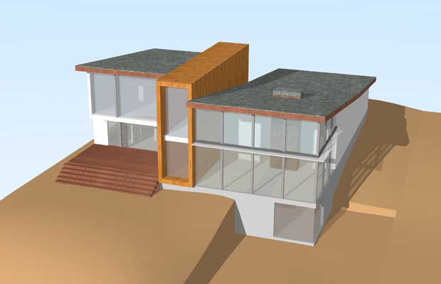
View from above. Only birds will see this, but it’s a good shot to envision how a rooftop deck might look atop the flat part.
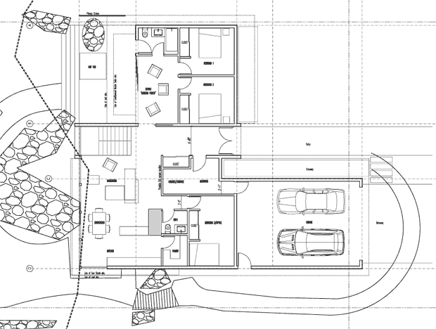
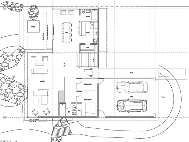
A proposed floorplan. Note that the stairwell is against the view glass and is intended as a bit of a centerpiece design element. It would certainly make walking downstairs a huge pleasure.
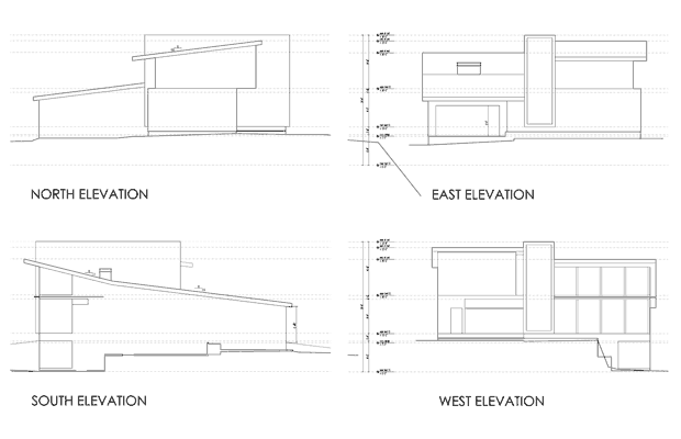
Sample elevations from all sides.
Model 2
View from above of the second model. Not nearly as nice looking as the first model, but more open.
Floorplan of the second model. Much closer to what I’m looking for than what was presented with the first model.
Thoughts on the two models
My overall impression is fairly straightforward: I like the exterior of Model 1 better and the interior of Model 2 better. I love how the rectangular structure in Model 1 breaks up the exterior of the house so it’s not so imposing looking, but I like how Model 2 puts all the bedrooms on the upper level (crucial for resale) and puts the living and dining rooms where I imagined they’d be all along.
We’re going to meet again this coming Friday at which point, Build will present a revised comp based on my thoughts and direction. The e-mail I sent them is below:
Hi guys. Great meeting today. I’m really excited by the direction and progress. Here are my thoughts:
Overall
The overall design aesthetic is more or less exactly what I’m looking for. You guys nailed that. Shed roof, not gigantic or overbearing, mid-century modern design cues, and open. As long as we pick the right exterior materials, this thing is going to perfect from the outside. Plenty modern, but timeless as well, without any elements that would scare off another owner (if god forbid, I ever had to sell).
Plan 1 vs. Plan 2
It’s probably best to start with Plan 2 and make modifications from there, merely because the interior layout seems much closer to what we’re looking for: three bedrooms on the upper.
Detailed Impressions
– There were only a few things I liked better about Plan 1, the most important being the breaking up of the north and south *exterior* sides with the beautiful wood rectangular thingie (BWRTâ„¢). I think that even if there is no interior function to the BWRTâ„¢ (e.g. to house the stairwell), it should be part of the house as an exterior design element. Probably front and back. It could be more subtle or shaped differently if need be, but I really like how it breaks things up from the outside.
– In order to create more room on the upper level, I think the double-heightness of the great room can be substantially narrower north-to-south. In other words, if you’re looking at the 3D view of Model 2 facing east, it has “5 panes worth of double-height” (Model 1 has 4). I think it could even be 3.25 panes worth, especially if we extend the great room eastward for the TV-watching area. If we go with 3.25 panes worth, the master (or a sitting area of the master) could extend into the previously double-height space (like in my model) or that space could be used for something else entirely. Basically, the double heightness could end right around where line C is in your schematic of Model 2.
– Building on the previous point, given that TV watching (and eating while TV watching) is a very common activity for us, we should probably start optimizing for that a bit. My initial feeling is that it should be in the southeast corner of the main floor since that would place it within eyesight of the great view but also potentially shielded from the glare by a half wall. Considering how far away from the west windows it would be, you might not even need a wall. If we place the TV room/space here, I would want the TV to be on the north or south wall. The other option that just occurred to me would be to put it in the north wing where the dining room currently is. This may actually be kind of nice considering the Nana Wall and the outdoor BBQ would be very useful during football and other parties that involve watching stuff on TV. If we put the TV room/space here, I’d want the TV on the south wall (where the pantry is now). As I look at it, this might be kind of cool because if you’re sitting on the couch facing southward watching TV, you may have a nice wide open view SSW through the house.
– The dining room feels right where you have it in Model 2. If the TV room/space ends up going there instead, the dining room could either go in the southeast corner or it could go in the “north living room” area where the extra couches and chairs are in Model 2.
– The kitchen should ideally serve the dining room, the TV room/space, and the living room. This isn’t a requirement or anything, but I’ve found that during parties, a lot of people tend to congregate in or around the kitchen so it would be cool to have it somewhat centrally located. That is kind of why it felt like putting it in the north living room area might be nice. I don’t want the location of the kitchen to cause us to compromise on the rest of the space though so don’t kill other spacing concepts for the sake of “no matter what” putting the kitchen in the north living room area. If it doesn’t work there, it doesn’t work there.
– It is not necessary for the wall north of the north living room to be glass. In fact, it might even be a disadvantage considering I want the outdoor BBQ against that wall. I really don’t think the view to the north is anything special from the main floor. I’d rather concentrate on maximizing that view angle from the top floor.
– I have no strong feeling about the stairs at this point. Use your judgement where they should be.
– I assume this is just because we’re still in rudimentary modeling stage, but none of the windows look like they open or could take screens. I assume at least some of the upper level windows in the great room will open and have screens.
– I don’t think we should be afraid of mixing some flat roof with some tilted roof. Maybe the north roof becomes flat to accommodate a deck and hot tub.
– I love the “open to below” element from the upstairs. Very cool. Would like to keep this if possible.
– If we narrow the double-height portion as mentioned above, maybe the BWRTâ„¢ is what gets wider and maybe that’s our rooftop deck and hot tub area? That might be kind of dope, and it would allow the north and south roofs to continue to be sloped. If the BWRTâ„¢ gets too overbearing if it is made that wide, maybe it becomes a floating BWRTâ„¢ instead. Imagine chopping off the bottom half of it essentially and have it only cut through the house from the second level on up. Just a thought… might not be a good idea.