Floorplans Finalized, Front Shaping Up Nicely
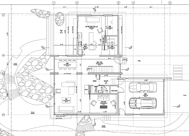
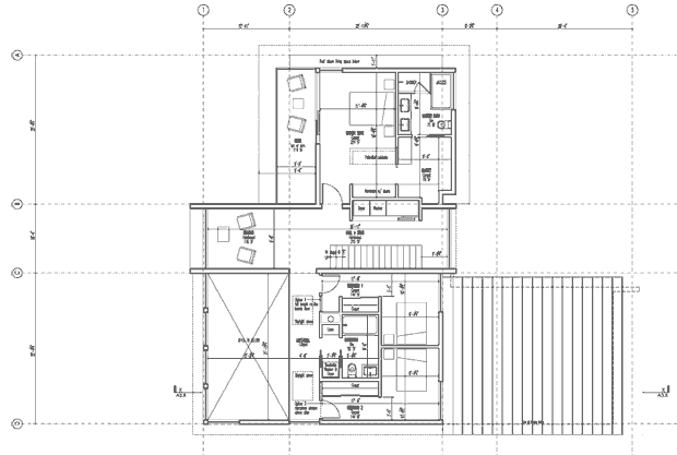
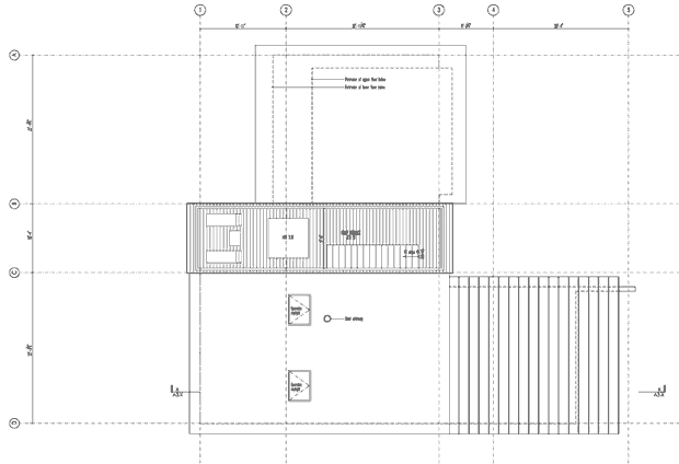
Over the last week, Build successfully made the (mostly) final nudges and modifications to the floorplans, and everything is now exactly where it should be. If you enlarge the floorplans below, you will see that the media room has increased in size, a couple of sliding walls have been added, the washer/dryer have been relocated, and a few other miscellaneous issues have been resolved.
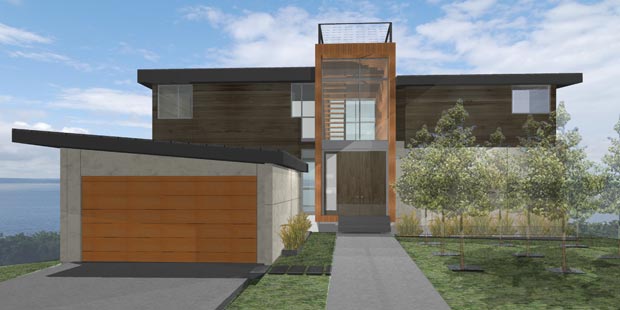
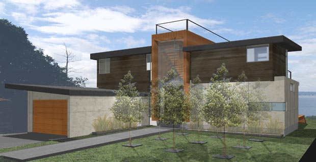
More importantly, however, the front of the house is looking much better now. During our meeting last week, we studied several different materials for the exterior of the house including corrugated metal, fiber cement, stucco, concrete, and a few different woods. Discouragingly, none of the comps that were presented made me jump out of my chair and say “that’s the one!”, but I encouraged Build to refine their rendering with more foliage and multiple camera angles and I would re-evaluate at that time. I have to say, upon leaving the office, I did have a nagging doubt in my head about whether or not the front of the house would ever end up working for me.
Not being able to think about much else, I spent my entire Friday night playing around in Photoshop, adjusting angles, colors, and a few other things. Modifying a 3D model in a 2D program is no easy task, but by the end of the night, I was able to produce a slightly modified model that already looked quite a bit better to me. I shot the model back to Build, and a few days later, they shot me an entirely new set of renderings that were much, much better than even my modded one. Thank god for modeling programs. I couldn’t imagine building a house without this sort of visual aid.
The front of the house is starting to look sharp now! See drawings below:
House front, view from straight-on
House front, view from northeast
Main floor schematic
Second floor schematic
Roof schematic
So, with everything looking great now, I need to do some serious thinking about how and where we can cut some costs associated with construction. So far, that’s proven difficult, as I’ve heard it always does. :)


Love the floor plan, but the front of the house still doesn’t jump out as me as much as the back. Very much improved, though.
Brian: Yep, the back of the house is still the money angle. The front’s much more of a challenge because you don’t want so much glass, for privacy reasons. It’s also a challenge in that the garage is very conspicuous.
Some windows in the garage could help to make it more interesting.
Example #1:
http://img186.imageshack.us/img186/6360/garagewithwindowsyr2.jpg
Example #2:
http://img525.imageshack.us/img525/562/greenroofworkshopviewfrqr3.jpg
Also, since you’re building a modern house, you should go for a modern garage door. It’s hard to go wrong with a glass garage door like these:
http://www.glassgaragedoors.com/gallery.htm
:-)
Dave: I thought about glass or polycarbonate, and I’m not against it, but there needs to be some sort of warm color somewhere on that garage face. If the actual door was glass, the garage face around the door would probably have to be warm wood… which might look great.
It’s looking pretty great. A glass garage door with a wood face might be really cool.
I haven’t seen this mentioned yet – but have you considered a green roof? It might be really cool, especially if it looks good, to have a green roof all around your hottub nest up top there.
I really like this layout Mike.
Particular highlights for me are the use of pocket doors and sliding divider walls. The application in the Media Lounge is particularly notable if the material dampens sound adequately.
The symmetry of Bedrooms 1 & 2 very is appealing. I grew up with an enormous bedroom and tiny closet and my sibling got a small room and walk-in closet. The stage was set for jealousy.
I like the clerestory window (Option 2) for the bedrooms with the large closet. I am unsure what Option 1 has to offer with the small space near the door.
I saw something interesting for that shared Bathroom you might consider (humbly offered). The layout of this bathroom utilized pocket doors to segment a shared bathroom so that shower, toilet and sink could each be used privately at the same time. I’m not sure how his might work with your linen closet and washer/dryer thrown in the mix, but here is the idea.
The sink is exposed to the hall way. The toilet is to the left behind a pocket door and the shower to the right behind a pocket door. In your circumstance, perhaps the sink, washer/dryer and linen closet could occupy the Chamber 1 while a second and third chamber is made for the toilet and shower respectively. Just an idea.
Lastly, if you haven’t heard of them before, you might consider a tank-less water heater (or a few located near the hot water usage points).
Mike, It feels weird to have to exit bedrooms 1 & 2 & go into the hall to enter the bathroom.
Rich
John B: Yeah, a green roof might not be a bad idea, but I’ll have to look into expense and maintainability. I’ve heard some people say that green roofs are great environmental additions and that they are no trouble at all and other people say they are a passing fad which don’t actually do what they purport to do.
Snowflake: Good idea with the splitting up of the extra upper floor bathroom. I’ll look into that. With regard to the tankless water heater, yep, I’m all over that. Talking to an HVAC consultant on Tuesday so we’ll see what he says.
Rich: Really? Aren’t bathrooms always down the hall from the extra bedrooms? Or do you mean it’s weird because the hallway is exposed to the living room below?
Mike, Yes, the hallway exposed to the living room below does make for an uncomfortable feeling & yes you are correct that bathrooms are very often located down the hallway. They don’t have to be. For example the bathroom could be reconfigured as a galley floorplan with the bathtub set midway in the room on the wall between the bedrooms with closet space opening into each bedroom on both sides of the tub & the rest of the fixtures on the wall opposite the tub with an entry door on each end from inside each bedroom.
Rich
hi!
interesting blog! i can imagine that your project will please you in the end! but from an architectural point of view, you have to think about proportions again. the sloped garage roof is definitvely wrong, it has no context, also the 1.5 window in the corner next to the staircase. try avoiding moving things to close together. if there should be a height difference between the two parts of the house, make it more obvious. the floor plan seems ok, although, you will pass around that staircase a million time, it is an l-shape and there seems to be too much of a hot point.
if you render again, don’t use to many distinctive materials with patterns, that is always distracting.
the good parts: materials ok, floor plan ok, site ok. keep it up, you are doing it!
if you need any help, contact me.