First Interior Renderings
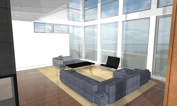
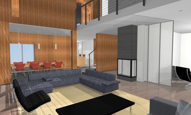
The first interior renderings from Build are in and they look great. I’m really loving how the aluminum framed windows look on west wall of the living room. I’m a bit concerned that all of the interior wood will be overwhelming, but I won’t have a good feel for what it will actually look like until I see multiple angles.
Anyway, here are the two best-looking renderings:


Are you letting most of the interior design (furniture/color/layout) be proposed by Build? Or are these pieces just ideas for interior layout to fill up the room?
I think you’re right about too much interior wood, the contrast between the large wooden wall and the white ceiling/walls on the other sides looks too sharp in my opinion.
Nano: Not sure about that actually. Build is definitely specing the interior stuff like lighting, but the furniture in the renderings is just for props. I am definitely not spending $8k for two Barcelona chairs :) Although they are quite nice.
Phew, I just spent 30 minutes reading this from the very beginning. Awesome job so far. I really hope to do a similar project in the future and this has provide plenty of great ideas. Keep the updates coming and I’ll be keeping up with your progress.
I really like the interior design Mike. Looks really good with a lot of natural light.
Mike,
From your level of involvement and some other comments, by now your designers should have thick skins, so I’ll dive in:
I know these are preliminary, but these types of renderings give the digital design process a bad name – if you lived in a real space with all those reflections, you’d probably go insane! Very rarely do natural materials ever have that much of a reflective finish.
Even simple tools like SkechUp have great plugins now that give you the natural soft bounced light of reality. If you are merely trying to work out interior design ideas, leave it cartoonish, but for renderings, there really isn’t any excuse these days for not using a global illumination type renderer.
Daylighting-wise, you have so much glass, that it’s probably a good idea to be exploring exactly what that space is going to feel like at different times of the day.
Most of these renderings are quick design studies, but they do show how the natural light ultimately ended up behaving in our spaces:
http://flickr.com/photos/marascos/sets/72157600067839972/
Sometimes in early studies it’s best to do away with any materials, and just look at light and the feel or scale of the spaces. If you are beyond that then I agree that there is a lot of wood. Using wood as more of an accent and simple gyp board walls can look quite good.
One of the easier rendering programs to use is Maxwell Render. However, Revit, ArchiCAD, and AutoCAD all now have built-in renderers with very good global illumination capabilities.
Thanks for sharing!
Needs a woman’s touch!
Cushions. Plants. Flowers in vases. Pictures of grandma. Kid’s toys everywhere.
On the other hand… huge tv, hifi and surround sound speakers….
Seriously, trust your architects. You are going to have a house to die for. Visuals will never capture how wonderful it is going to be sitting there and watching the sun go down, with music playing.
Mike,
Ryan hooked me up with your blog. Great stuff.
Congrats on the MSN deal and your new digs.
In hexadecimal terms, my current shade of envy is #333300.
Nick
Angelo,
Your points are well taken; there is substantial room for improvement in the first round of renderings and you’ve contributed valuable knowledge to the discussion. Thank you for that. A couple of things to keep in mind about these renderings and our process in general:
The first round of images we generate on any given project typically focus simply on getting the architecture blocked out and representing materials. In the first round the light is quick and dirty – we’re simply illuminating the interiors to review the form and make further decisions. Many of these subsequent decisions involve the material properties and quality of light.
The finished products of our firm are built-works. While renderings are an important part of the process we would be hesitant to sacrifice the technicalities and craft of the final built architecture for high-end sexy renderings. In an ideal world you can do both. Our world typically involves budgets, schedules and deadlines. When pressed, we choose the final architecture over the intermediary presentation. That’s not to say its right or wrong – just how we tend to work. We are architects and builders first and foremost.
We still rely on the mind’s eye in our design process. We like to get the renderings to a place in which we’re confident that our ideas will translate well into built-form. Typically we’re not shooting for photo realistic images. It could be argued that the more accurate the images are the more comfortable the homeowner will be with the design. Fair enough. Rendering techniques and graphic presentations will continue to evolve – today’s high quality renderings may very well look dated in 10 years. We see an architects education and experience as a more timeless method. Developing a trust with a homeowner to believe in our mind’s eye will always be more important to us than renderings.
Rendering technology has evolved immensely and the speed of computers continues to accelerate, however that doesn’t mean that producing high quality renderings with accurate lighting conditions is fast. Even the renderings above, without an emphasis on light and shadow, require hours of rendering time – not to mention the time to generate the models. Maybe Rhino and Form-Z aren’t the best software to be using – in which case we’re all ears. We’ll look into Maxwell Render and Revit.
We’ve looked through the images at http://flickr.com/photos/marascos/sets/72157600067839972/ and agree -the quality of light is quite nice and definitely a worth aiming for.
-team BUILD
Mike, interesting site that might give you a few interior ideas: http://www.wallpaper.com/architecture
On the topic of presentation and rendering techniques, we did a blog post a while back which focused on some current methods that may be of interest:
http://blog.buildllc.com/2008/04/18/a-new-visual-language-for-architecture/
Mike,
The Build crew has extensive experience designing some great spaces. This was a friendly nudge to encourage them to use some of the tools and methods that are so well documented on their blog. I’m sure from their experience the design will be excellent.
Chris: Thanks. Good stuff at that link!
Angelo: Totally. I appreciate your thoughts and agree with the general sentiment that renderings and lighting make a big difference when showing ideas to clients. Even though I’m a professional designer (albeit in the 2D world) I have a hard time looking at mockups unless everything is perfect.
Mike, another site for inspiration: http://www.tdc.gr
Interesting use of materials inside.
Why does the (overpriced) Barcelona chair not have an (overpriced) ottoman in front of it?! ;)
Yes, all of that wood is going to be a bit much, unless you have some of it covered by artwork, mirrors, etc.