The First Designs are In!
About a week ago, I met with Build to review their first design concepts. Build presented two separate concepts based on the pre-design meeting we had two weeks prior.
Overall, I have to say that I am thrilled with the progress. Both designs exhibit the exact design esthetic I’m looking for, while differing enough in their floorplans to present a great set of options for moving forward. I can’t stress enough the importance of hiring an architect who will show you full 3D renderings at design stage. You just can’t get a great feel for what a house is actually going to look like from a few two-dimensional schematic drawings. Below are some samples from the documents provided by Build:
Model 1
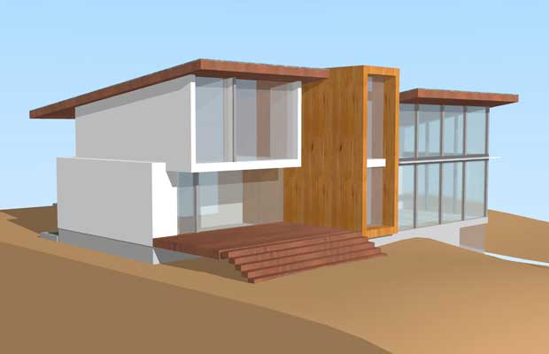
View from northwest of the house. This is the “back” of the house, but it’s the side that faces west, towards the huge view.
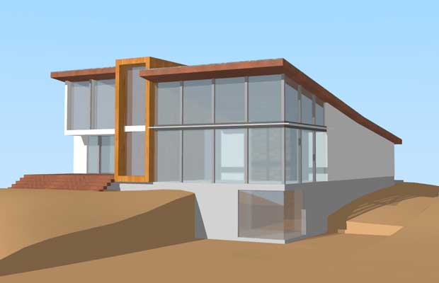
View from the lower lawn, looking up at the house.
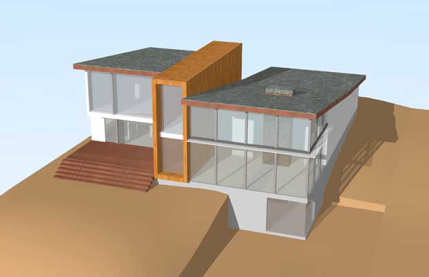
View from above. Only birds will see this, but it’s a good shot to envision how a rooftop deck might look atop the flat part.
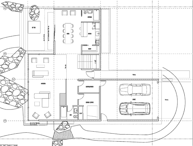
A proposed floorplan. Note that the stairwell is against the view glass and is intended as a bit of a centerpiece design element. It would certainly make walking downstairs a huge pleasure.
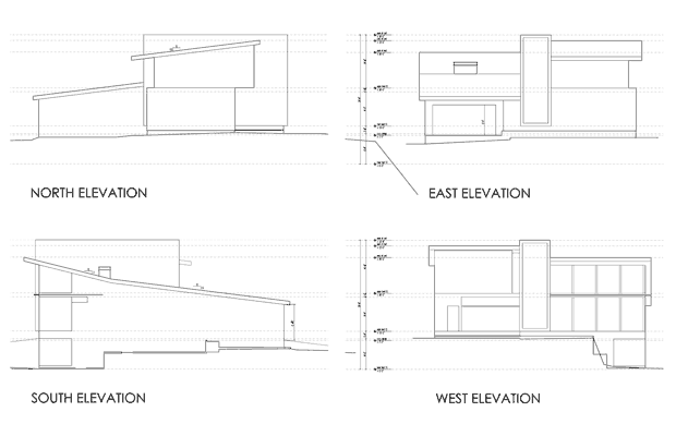
Sample elevations from all sides.
Model 2
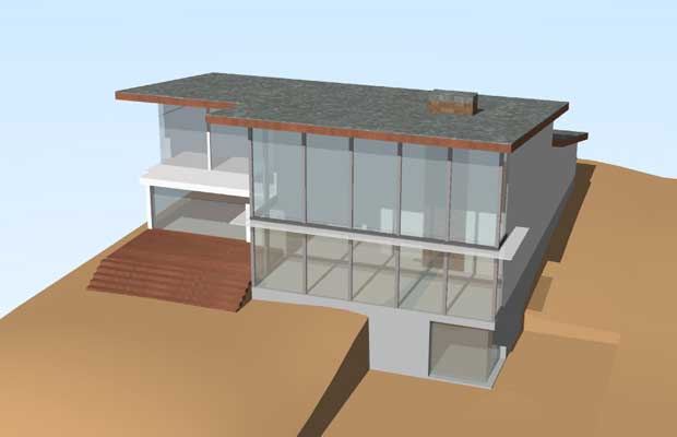
View from above of the second model. Not nearly as nice looking as the first model, but more open.
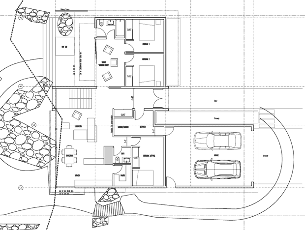
Floorplan of the second model. Much closer to what I’m looking for than what was presented with the first model.
Thoughts on the two models
My overall impression is fairly straightforward: I like the exterior of Model 1 better and the interior of Model 2 better. I love how the rectangular structure in Model 1 breaks up the exterior of the house so it’s not so imposing looking, but I like how Model 2 puts all the bedrooms on the upper level (crucial for resale) and puts the living and dining rooms where I imagined they’d be all along.
We’re going to meet again this coming Friday at which point, Build will present a revised comp based on my thoughts and direction. The e-mail I sent them is below:
Hi guys. Great meeting today. I’m really excited by the direction and progress. Here are my thoughts:
Overall
The overall design aesthetic is more or less exactly what I’m looking for. You guys nailed that. Shed roof, not gigantic or overbearing, mid-century modern design cues, and open. As long as we pick the right exterior materials, this thing is going to perfect from the outside. Plenty modern, but timeless as well, without any elements that would scare off another owner (if god forbid, I ever had to sell).
Plan 1 vs. Plan 2
It’s probably best to start with Plan 2 and make modifications from there, merely because the interior layout seems much closer to what we’re looking for: three bedrooms on the upper.
Detailed Impressions
– There were only a few things I liked better about Plan 1, the most important being the breaking up of the north and south *exterior* sides with the beautiful wood rectangular thingie (BWRTâ„¢). I think that even if there is no interior function to the BWRTâ„¢ (e.g. to house the stairwell), it should be part of the house as an exterior design element. Probably front and back. It could be more subtle or shaped differently if need be, but I really like how it breaks things up from the outside.
– In order to create more room on the upper level, I think the double-heightness of the great room can be substantially narrower north-to-south. In other words, if you’re looking at the 3D view of Model 2 facing east, it has “5 panes worth of double-height” (Model 1 has 4). I think it could even be 3.25 panes worth, especially if we extend the great room eastward for the TV-watching area. If we go with 3.25 panes worth, the master (or a sitting area of the master) could extend into the previously double-height space (like in my model) or that space could be used for something else entirely. Basically, the double heightness could end right around where line C is in your schematic of Model 2.
– Building on the previous point, given that TV watching (and eating while TV watching) is a very common activity for us, we should probably start optimizing for that a bit. My initial feeling is that it should be in the southeast corner of the main floor since that would place it within eyesight of the great view but also potentially shielded from the glare by a half wall. Considering how far away from the west windows it would be, you might not even need a wall. If we place the TV room/space here, I would want the TV to be on the north or south wall. The other option that just occurred to me would be to put it in the north wing where the dining room currently is. This may actually be kind of nice considering the Nana Wall and the outdoor BBQ would be very useful during football and other parties that involve watching stuff on TV. If we put the TV room/space here, I’d want the TV on the south wall (where the pantry is now). As I look at it, this might be kind of cool because if you’re sitting on the couch facing southward watching TV, you may have a nice wide open view SSW through the house.
– The dining room feels right where you have it in Model 2. If the TV room/space ends up going there instead, the dining room could either go in the southeast corner or it could go in the “north living room” area where the extra couches and chairs are in Model 2.
– The kitchen should ideally serve the dining room, the TV room/space, and the living room. This isn’t a requirement or anything, but I’ve found that during parties, a lot of people tend to congregate in or around the kitchen so it would be cool to have it somewhat centrally located. That is kind of why it felt like putting it in the north living room area might be nice. I don’t want the location of the kitchen to cause us to compromise on the rest of the space though so don’t kill other spacing concepts for the sake of “no matter what” putting the kitchen in the north living room area. If it doesn’t work there, it doesn’t work there.
– It is not necessary for the wall north of the north living room to be glass. In fact, it might even be a disadvantage considering I want the outdoor BBQ against that wall. I really don’t think the view to the north is anything special from the main floor. I’d rather concentrate on maximizing that view angle from the top floor.
– I have no strong feeling about the stairs at this point. Use your judgement where they should be.
– I assume this is just because we’re still in rudimentary modeling stage, but none of the windows look like they open or could take screens. I assume at least some of the upper level windows in the great room will open and have screens.
– I don’t think we should be afraid of mixing some flat roof with some tilted roof. Maybe the north roof becomes flat to accommodate a deck and hot tub.
– I love the “open to below” element from the upstairs. Very cool. Would like to keep this if possible.
– If we narrow the double-height portion as mentioned above, maybe the BWRTâ„¢ is what gets wider and maybe that’s our rooftop deck and hot tub area? That might be kind of dope, and it would allow the north and south roofs to continue to be sloped. If the BWRTâ„¢ gets too overbearing if it is made that wide, maybe it becomes a floating BWRTâ„¢ instead. Imagine chopping off the bottom half of it essentially and have it only cut through the house from the second level on up. Just a thought… might not be a good idea.

Man, I am so jealous. Two of my aunts used to have huge lakefront homes on Mercer Island and I used to love visiting. It’s hard to tell from the plans but is there a fireplace? Gotta have a fireplace.
Michael: The architects are trying as hard as they can to keep the existing wood burning fireplace. Personally, I think it might get in the way since it’s in the center of the great room (see models), but if it goes, I’ll put in a couple of compact gas fireplaces.
I dig this blog! I’m thinking about doing the same thing and this is a great resource to learn from someone else’s experiences. Thanks for taking the time to start it.
As far as the designs go, I don’t want to be a “kill joy” but I don’t like either. They look very 70’s to me. I’d suggest going back to the architect and see if they can can work on the flatness of the roof and the boxy features. I think a more modern look might make you happier longterm and add more resale value.
I like both models.
Love the soaring shed roofs, they’re very appropriate for a property with such an awesome view.
Will the roofs be supported by beams? Like exposed glulam beams maybe?
Wow! Such an exciting project. I would be so excited. The success of this sort of project is often in the details and finishes. Do you have a target completion date?
Yes, I prefer the first design as well.
My only concern would be all that west facing glass. It may generate too much solar gain in the summer months making the house uncomfortable. I guess the view is to the west so you should consider installing exterior blinds.
Todd: To each, his own. :) Remember that these are still very rudimentary design forms and don’t reflect the actual details of the house. They are only meant to get the general shape and interior layout pounded out. As far as looking a bit retro-modern, that’s definitely what I’m going for.
Dave: Good question. Not sure how the roof is supported yet. Maybe I’ll have Andrew and Kevin at Build chime in about that.
Chris, if the house is ready to move into by January 1, 2010, I’d be super happy. If it’s a little later, that’s fine too. The plan is to break ground this spring and generally, they say it’s 9-12 months until you can move in at that point.
Steve: Totally. Solar gain and heat loss are going to be huge issues to make sure we take care of. I’m going to go with Low E, Low Gain argon-filled windows which should help a lot, but then yeah, some sort of motorized blind system on top of that.
I think the one key comment to reiterate for Todd, Dave and Steve is this- we are in preliminary schematic design (haven’t even begun locating other windows/ doors besides the west face). We like to think of this part of the process as the adolescent start to the design- the arms are a little gangly, the voice squeaks at odd times, and you know, the acne. We have intentionally not refined or shaped the design yet- its all about sequence/ relationship of volumes as well as getting the basic guiding parameters addressed.
Like you Mike, I really like the exterior of the first design but the layout of the second design.
I know you’ll most likely be moving some rooms and spaces around, but what was the rationale behind a full bath on the north side of the kitchen? Other than filling the bathtub up with ice and drinks during parties, I really can’t see much use for a bathtub in that location. Maybe switching the pantry and bathroom and making it a half bath would allow for more kitchen space and the possibility of an “island bar” instead of the bar the kitchen currently has. Then the kitchen would have two entrances rather than one – and since you seem to enjoy entertaining – more access to the kitchen seems like a great idea to me.
Either way, I’m really enjoying the site and look forward to seeing how the design evolves in the coming months!
Kyle: Good question. Probably (definitely) don’t need a full bath in there. I don’t love the location of the kitchen in general (see my note to architects above) but could be talked into it.
In response to some of the questions/comments/concerns above, we (BUILD) put together a quick and dirty guide to our architectural process which you might find interesting: http://blog.buildllc.com/2008/09/23/the-process-of-architecture/
Kyle – the bathroom was positioned north of the kitchen to accommodate the adjacent hot tub. However the hot tub is moving upstairs in the next couple of schemes, stay tuned…
First off, great idea for a blog and even more so that it’s about the realities of
building a modern home. I’ve scoured the web landscape and nothing this detailed
exists to give people a true and honest look into the process from all angles.
I think its terrific that the architects are weighing in on the feedback on the blog
as well because its important that rationale is explained for decision-making.
Taste is certainly subjective when it comes to what people like as far as designs but if you dig deeper there are some rich nuggets
to be had here in terms of learning and getting to be a fly on the wall during
what is both an exciting, stressful and tremendous opportunity to
craft something custom and highly personal to the owner. Look forward to seeing
how this all plays out.
What happened to your 5-sentence e-mail rule? Kidding, of course.
I’d like to see either house modeled from “cliff view”, or what it would look like amid the neighboring houses, from the bay.
Hi Tiff! Yeeeeeeeah, had to violate the 5-sentence rule in a big way. :) With regard to the neighboring houses, the house on the north is a large, flat, awesome Paul Hayden Kirk mid-century modern house so it should blend in nicely, and the house on the south is barely visible through the foliage.
Okay dude, you need to post bigger pictures so people can actually see the floor plans.
One thing you may want to consider with the BWRTâ„¢ is making the south facing part a stone wall for some passive solar heating. I’m not exactly sure how these walls work but that wall should have lots of sun during the winter months.
Mike, I see that you are having a lot of fun with this process so a few additional ideas. You might consider the efficient advantage of entering your house from the garage through a combined laundry & pantry area into the kitchen.
I am a big fan of separating the private & public areas of one’s home.
Here are a couple of other ideas to consider: If you are going to place all of the bedrooms upstairs you might consider putting an elevator in & in that case the laundry upstairs as well.
Or consider placing the master suite on the ground floor as well.
Another wild idea is to place all of the private space on the ground floor & the public space including the kitchen on the second floor.
You are at the design stage & ideas are cheap on paper so all should be explored.
L: True. Working on it…
Rich: Yep, public and private are separated by stories. Probably don’t need an elevator just for one floor, but I’m definitely putting the laundry room upstairs.