Guiding the Design Process with SketchUp

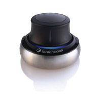
The 3D Connexion Space Navigator
I’ve mentioned Google SketchUp before as the only 3D modeling application I could wrap my brain around. Even as a professional designer who has used Photoshop, Illustrator, and a host of other applications for over 10 years, all other 3D and CAD programs are just way too complicated for me.
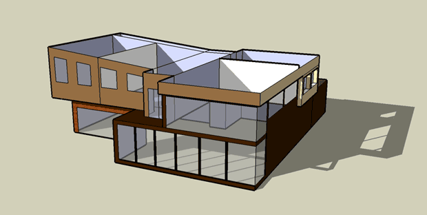
The great thing about SketchUp — besides the fact that you can learn it in a day or two — is that it helps you figure out in your own mind what you want your new home to look like and produces great models that you can e-mail to your architects for guidance. I’ve never had a problem expressing myself with words, but when I met with my architects a couple of weeks ago to go over pre-design concepts, I found myself sketching clumsily on vellum paper and trying to artfully explain in words what could be expressed in about five seconds with a 3D mockup. After the meeting, I went home, spent a couple of hours in SketchUp, and produced the following model:

A view of the back of the house. This would be the side facing Puget Sound.
Is it pretty? Nope. But it illustrates several important concepts I wanted to get across:
- Double-height great room on the south side
- Nana Wall on the northwest side connecting the dining room to the deck
- General bedroom arrangement with a deck facing northwest from the master
- Plenty of glass
- Stained wood siding but only used sparingly
None of these things are meant to prescribe exactly what the house will look like, but it’s invaluable to be able to put something like this in front of your architects with only a few hours worth of work. I have another meeting with them tomorrow and they could either match the model closely or go off in another direction entirely and either could work out great, but with this model, I can at least compare their solution(s) with something that I think would work for me. I made sure to tell them not to take any style cues of the admittedly rudimentary model, but only general layout cues. We’ll see what happens. I’m excited.
While we’re talking about SketchUp, I thought I’d mention a SketchUp companion product you might want to purchase if you plan on spending a lot of time in the program. It’s called the 3D Connexion Space Navigator and it’s essentially a three-dimensional mouse which lets you zoom, pan, rotate, and orbit your model by moving your hand in a three-dimensional motion. It’s bizarrely effective and it saves you from having to constantly switch between tools in SketchUp just to view your model from the right perspective for the task you’re working on. The thing is as heavy as a large paperweight, which is necessary because in order to pan up, you actually pull up vertically on the device, and to zoom out, you push it away from you. If it was light, it would move all over your desk, but since it’s so heavy, it stays in place as you exert light amounts of force on it. Really, really cool. I got mine at Amazon.com for $57.97 including shipping and tax. Props to my buddy Danny over at Mavromatic for suggesting this.
Costs accrued during this stage:
| 3D Connexion Space Navigator 3D Mouse | $57.00 |


Pardon my ignorance but I’m just curious what’s so special about NanaWall? I obviously fail to see it by looking at their website.
Jernej: The idea with Nana Walls is that they kind of make an entire wall disappear. It’s like taking the “wall of windows” concept to the next level. So when the Nana Wall is open, there is no barrier between the inside and the outside. Kind of turns a room into a covered patio almost.
Sketchup really is great. I used it to design my basement (see the link on my name for a picture). I also used it to make final blueprints for approval by the city and my use for framing. Sketchup worked just as good as any professional engineering software for a project like this.
By the way, love the blog. I wish I had done the same when we built our house, although it was certainly a project of a smaller scale :)
Neat.
FYI…the Sketchup link is bad.
(Editor’s Note: Thanks Omar. Fixed!)
Thanks for the tip on the Space Navigator – that sounds like a great way to explore a 3D model.